The Null Device
Posts matching tags 'peter saville'
2010/10/26
The latest project from Peter Saville, who designed Factory Records' covers and posters and contributed to their coolly enigmatic image: a headstone for the late founder of Factory, Tony Wilson, which is appropriately stylish and minimal and yet with a gravitas outside of the throwaway realm of pop culture:
The headstone, which is made of black granite and set in Rotis, was unveiled just over three years after Wilson passed away; one could probably make a reference to Saville delivering Factory gig posters after the actual gig. It does not have a Factory catalogue number, as Wilson's casket, FAC 501, was the last one ever to be issued.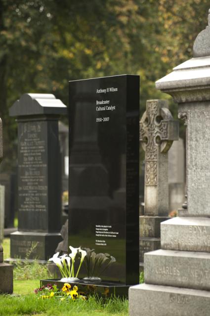
2006/2/7
The BBC is running a poll of British design icons. On the current page are 25 candidates; there are the usual design classics (Jan Tschichold's distinctive Penguin paperback covers, red phone boxes, Routemaster buses, the Mini (and the miniskirt!), and Harry Beck's Tube map), and also some more recent entries, including Peter Saville's cover for New Order's Power, Corruption and Lies, Neville Brody's design of The Face magazine, the Dyson vacuum cleaner (what about the Henry?), Lara Croft and Grand Theft Auto. Oh, and the World Wide Web, because the first form of it was developed by an English bloke.
Not to mention a few things I didn't know were British, such as the Chopper bicycle now ironically popular with SugaRAPE-reading hipsters (apparently it's not Californian, just a knockoff of Californian designs) and Microsoft's Verdana typeface (designed by British-born type designer Mathew Carter). In that case, I wonder why they didn't include the iMac or iPod (whose appearance was designed by Englishman Jonathan Ive).
And it's interesting to read that Britain's current system of road signage was (re-)designed in the 1960s. Which probably explains why Australia has entirely different (US-style?) signs.
2005/4/4
Oh dear, the artwork for the upcoming album from adult-contemporary band Coldplay doesn't half look like one of Peter Saville's early works: (via xrrf)

I wonder whether this (and the album's somewhat mechanistic title, "X&Y") means that the band, known for their unchallenging and somewhat schmaltzy easy-listening balladry, are attempting to go for a cold-and-detached aesthetic; perhaps to appeal to nostalgic late-thirtysomethings who grew up listening to Factory Records bands but have since mellowed somewhat. Mind you, if they take it too far, it could alienate their fanbase (ironically enough, the band they were groomed by the press to replace after they went too weird, Radiohead, did something much like that). Then again, I'm sure the band and their label know which side their bread is buttered on. Perhaps this means is that there will be a veneer of retro-fashionable electronic glitchyness grafted over the usual reassuringly saccharine core of ballads.
2001/3/15
According to Q magazine, the best album cover of all time is the one from God Save The Queen, by the Sex Pistols. #2 is Joy Division's Closer, and #7 is New Order's Blue Monday (hang on--wasn't that a 12" single? Or do they mean Power, Corruption & Lies?), also designed by Peter Saville.